Welcome, Guest. Please login or register. Did you miss your activation email?

Show Posts

This section allows you to view all posts made by this member. Note that you can only see posts made in areas you currently have access to.


Messages - Glocke

Pages: [1] 2 3 ... 20
1
Working on v0.2-alpha

Atm, the major milestone is overhauling the entire physics system to purely float-based movement and proper collision (using different 2d collision shapes). After a sh*t pile of work and unit testing, I finally was able to make the game run again :D

#RefactoringIsKing


2
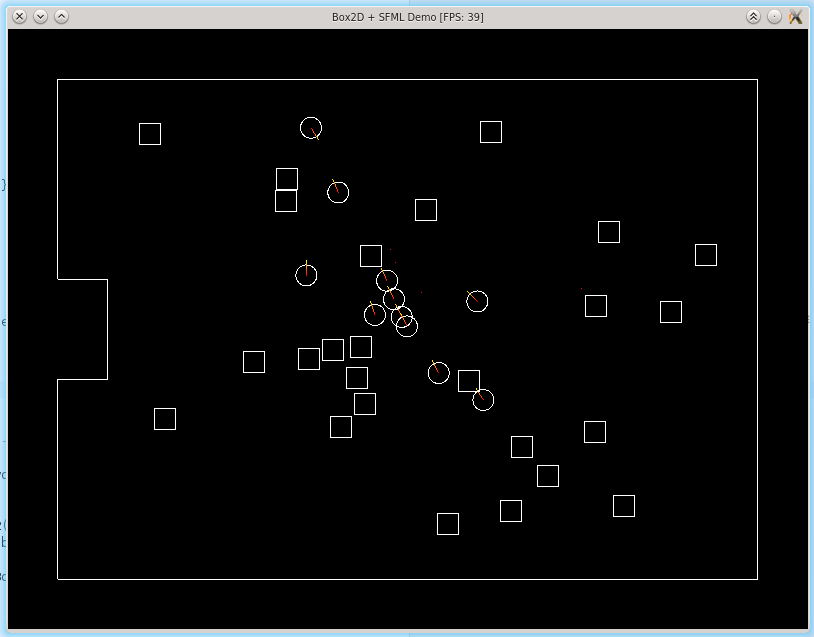
I plan to change the entire physics implementation to be more flexible - and hence - be based on Box2D.
So I build a quick'n'dirty example program for integration Box2D into a simple SFML-Application in the context of a topdown perspective.

I'm looking forward implementing the lessons I've learned 8)


GitHub Link to the example: https://github.com/cgloeckner/sfml-box2d-demo

3
SFML projects / Re: [Release][GUI] SFML + ImGui lib
« on: January 11, 2018, 09:38:53 am »
Make the compiler do the copying for me.

I didn't get it managed. Can you explain your approach more in detail, please? :)

4
SFML projects / Re: [Release][GUI] SFML + ImGui lib
« on: January 06, 2018, 12:56:51 pm »
Is there a way to use imgui & imgui-sfml using git submodules? I encountered a problem related to the custom     imgui config, which needs to be overwritten (as you wrote on your github readme). My workaround is to fork the official imgui, replace the config and use this repo as submodule. But I'm not satisfied by this solution.

Is there a way to determine an external imconfig without replacing the file?

Like
./
    extlibs/
        imgui --> submodule to the offical imgui
        imgui-sfml --> submodule to your imgui-sfml
    include/
        imconfig.h --> my custom imconfig


I want to keep thirdparty libs and my code separate.

5
Meanwhile I found same spare time to continue my work. My current schedule contains improving the movement system (going away from the strict tile-attached movement to a way more "free" floating-point-like way of moving).

Hence my cmake configuration was total bullshit, I started there :D Idk when the next vital sign will appear... but it WILL! :)

So far
Glocke

6
Since I haven't released something since quite a while, I decided to release the full source of this project on GitHub.
Maybe someone wants to dive in and revive the project.

I plan to return on some point. but idk when this will be.

https://github.com/cgloeckner/racods-lair

7
SFML projects / Re: Racod's lair - a coop dungeon crawler [Demo Release]
« on: December 07, 2016, 04:05:15 pm »
Thx for your testing! :)

The game crashed once when pressed ESC during a game, but I've failed to reproduce this problem (Windows 10, x64). Other than that, no other significant technical issues.
Glad there's nothing significant ^^  But the crash on esc sounds really interesting :)

I would rather use the mouse for facing a direction and attacking, but if you do commit to the arrow keys to change players face direction, make so the players ALWAYS face the direction they are walking UNLESS they are pressing the arrow keys. Since you are walking through straight corridors, the enemies will always appear in front of you, so it makes sense to have you facing walking direction by default.
Yes! Mouse support and minor other input things are scheduled. Stay tuned! :)

- Make the ladders more visible so the player inevitably notice it if he finds it.

- Since there's a lot of walking around, you should consider having a sprint button if you haven't yet.

- The health bar is red. The health increased labels are green. I'm confused.
Thanks, I'll consider that!

- The ranged combat has some skill involved since you can dodge projectiles and completely avoid melee enemies, which is good. The melee combat on the other hand doesn't seem to have any skill involved. You can't block, you can't predict when the enemies' melee attacks are going to land, you hold space bar and hope you don't die. Something you can do though is strategically place your character in a 1 tile wide corridor so only one enemy can hit you at a time, so maybe you can explore this idea further when implementing abilities.
To be honest, I'm not happy with this lack of skill-involve-unbalance. I scheduled an idea on shields and blocking attacks etc. This needs definitely more work!

Anyway, it has growth potential. About your plans to change the perspective, I particularly like the top-down perspective, as long as everything is polished in the final version. These new prototype sprites look pretty good though, reminds me of Crawl.
Good job, keep up the good work!
Thank's and that's a point, too: I think the shown perspective would make it (from a graphical perspective) too similar to crawl (which I want to avoid). Until now, the pure (not slightly altered) topdown perspective is not that common afaik. Possibly a feature to keep.

I found a glitch I have not been able to replicate.

I switch my quickslot to no 1.
Pressed enter on a wooden chest(thought they opened)

Crash.
Thanks! Hmm, difficult to debug.. any console output or similar things available for this crash?

8
SFML projects / Re: Racod's lair - a coop dungeon crawler [Demo Release]
« on: December 01, 2016, 10:30:40 am »
I currently think about changing the graphics style (including perspective). Some prototype sprites are already finished:


9
SFML projects / Re: Racod's lair - a coop dungeon crawler [Demo Release]
« on: August 11, 2016, 07:17:20 am »
Gave it a try and I found it really enjoyable except it wouldn't work with my xbox one mini controller.
Glad you like it! Does your XBox One Mini Controller work with a basic SFML-based application?

Anyway I hope to see this again in a alter version - if I do I'll definitely download again.
Thanks, I'll do further work once I've got more free time :)

10
SFML projects / Re: Racod's lair - a coop dungeon crawler [Demo Release]
« on: August 10, 2016, 02:43:26 pm »
It feels like a player is aligned to some grid. Is there a reason for doing this?
It's because all objects are aligned to the tile grid. I made this assumption in the early beginning for simplifying the later systems that are based on that (like collision or aiming). The initial idea was to allow the game to run with as less computations as possible - I'm also testing it on a netbook.
Also, I found this behavior suitable for the traditional oldschool rogue-likes. But I was thinking about moving to "more modern" non-grid-aligned movement from time to time.

Attack animation doesn't tell you about attack hitbox. I'm not sure how far I can reach with it and if I can attack things in front of me or not.
Basically, the melee hit range is about exactly one tile. But I enlarged this to allow chasing an enemy through melee. But there's an audio feedback if you really hit the opponent :)

It's unclear if I hit enemy or not. There should be sounds when you hit something
Maybe the enemy-was-hit-sound gets lost in the madness of sound effects :S

Their health bar should probably be above them because it's hard to look at their health meter that's so far away.
Good point!

Maybe you can add some numbers which appear when they do damage to you or you do damage to them?
The damage towards the player is already shown. But I don't want to mess up the hud by damage towards the enemy :S

Attack animation should look something like this [...] Check out this animation's frames. It starts slow and then the attack itself is very fast. This is how attack should feel.
Thanks for that!

P. S. If you want me to give feedback on other aspects of the game, please tell me, I'll play a bit more and provide some additional feedback. :D
I'll really looking forward to some multiplayer feedback, because it allows local coop :)

Good game, keep working on it!
Thanks for testing and your feedback!
At the moment there's not that much time. But the development will be continued - for sure!!

11
No problem!  I hope some of it was useful!
Sure it was!

I'm looking forward to some feedback on the multiplayer mode :)

12
Hello, saw your post on twitter, so I thought I'd drop in and give my impressions.
Great, you're welcome! :)

is there a reason that the character and save file names have a minimum length?
Not really, it was just a quick idea ^^

-Make the damage done by you (and enemies) more visible, maybe make the text larger when a large amount of damage is done
The damage by enemies is indicated by the labels. If the player's damage is shown, too this messes up the screen with (in my opinion) too many numbers. But feel free to discuss @ all.

-I think a mini-map will help a lot.  I got lost and wasn't sure where I was supposed to go.
Well, yes, that would help. But I'm unsure whether this fits the genre well... but I'll note that minimap-idea! :)

I'm not sure where my health is?  I thought the blue and red meters were health and mana, but they didn't change when I got hit, are they potions?
Health is red, Mana is blue. The meter's behavior and graphics do not match 100% each time. In fact, if you've got a little damage, the cork of the tube hides the upper end... that's now on the list, thank you :)

-I wasn't able to pick up the plus icons (I'm assuming they're power ups of some kind), but then at one point I could pick up one of them.  I'm assuming eventually I took damage, and the game then let me pick up the health up.  Maybe allow players at full health to pick up the health-ups for a small amount of experience or money instead?
Since no potions are implemented, I added those powerups for this demo. They are automatically used if necessary if you enter their tile. But I plan to drop them later.

Overall, I think it's a very good start, it will be interesting to see your progress!
Thanks!

As a side note, is there any mechanical difference for light and dark areas?  For example, could a rogue hide in the dark, or sneak attack someone?  I realize features like this are probably a way off, but just curious about the design direction you're headed in.  I think if you did have something like that, you could distribute the light less evenly, so it might be visually a little more dynamic.
Well, the entire lighting can be disabled (e.g. if necessary due to performance on machines with a lowend graphics card). So I don't want to add lighting-related mechanics, because they would be ridiculous after disabling lighting :D

Thanks for your feedback :)

13
Thanks for the explanations :)
You're welcome! I added the "highlights" to the issue section of the game data's github repository (the game itself is yet closed source but the repo contains the game data)

Window Resizing: It just shouldn't be that a user with a bigger screen (resolution) sees more of the level. Playing the game in a small window shows significantly less of the dungeon. Not fair :P
Well ... "fair" is not the right word in that case :D All players (playing together) share the same screen :P But I share that feeling of unfair due to screen size ... I'm unsure what to do here... because I don't want to stretch the screen ^^

Fullscreen: We've also had to fight with the SFML fullscreen bug on Linux (and Mac). I'll drop you a PM.
Thanks.

Ramp: a "slope". It was just unexpected, regarding the wall shape.
So, if the player would "slide" along the book shelfs would be better? :)

Anyway, I'll keep playing and exploring then ;) looking forward to see more of that great game.
8)

14
Nice! I've been waiting for this :D

Tested on Windows 10, x64

First impression
Dark, creepy, love it! Especially the music. You wrote you used certain samples, so I guess you've created it yourself? It fits pretty well, menu and ambience. The only thing I'd change is to make it loop smoothly.

Thanks!! You mean the music transitions?

Fullscreen The game's options say "fullscreen" but it isn't. It actually creates a borderless window with the given resolution. SFML supports fullscreen and if you want to stay with a borderless window, you can read out the resolution of the users screen and use that if fullscreen is checked
This is unfortunately a workaround: The fullscreen on linux is broken for me, so I switched to that solution. I also faced issues when running through wine, so it seems like I totally forgot about that! :)

Window Resizing ... doesn't work as expected. The canvas is fixed. If you want it like that, don't give the user the option to resize the window. [/li][/list]
Can you make a screenshot?

Close Button If you are inside a dungeon and press the close button, the game switches into the menu (pause). I'd expect it to close.
Good point ... fast exit should be possible.

I'm dead, help me! As I'm a noob in roguelikes, I died very very soon. Is there anything I can do  to revive my char? If there is, make it clearer. Otherwise, show an option on the screen to return to the main menu.
Reviving characters is implemented but not used by the alpha demo. But there'll be spells to revive your friends - or even a limited number of free revives. Anyway, you can just pause the game and quit to the menu.

Saves There is an option "autosave" in the settings.  Is there also an option to save manually?
Yes: quit the game. This option prevents savegame loss in case of a crash.

Collision Some corners (and barrels?) behave like a ramp, but they're drawn like a square. If you are able to have ramp collision, why not draw it as one? :)
What do you mean by the term "ramp" exactly? That avoid-wall-collision-by-automatically-changing-the-movement-direction?

Also, this strange behaviour:

It shakes when I try to walk against a corner. It doesn't when I walk against straight walls.
That's pretty cool :D Even cooler: I cannot reproduce this with wall tiles but with objects (barrels etc.). But I've got an idea about the root of that evil :)
EDIT: Meanwhile, I'm able to reproduce it :)

Mana I played as a rogue. What is the mana for? (Give us a special attack :P)
Technically, each character can use spells (later^^). Atm there is only one way to consume mana: be a wizard. Later, all characters will have possibilities to use their mana :)

Shooting arrows doesn't need any mana and I can just spam them by staying on space. There is no penalty for this behaviour. Maybe change it to attack only when space is just pressed and not repeat if it's always pressed.
Well, the bow-animation should be played and the arrow should spawn delayed. Is this not happening? I'm not sure what you're describing :)

Chests How can I open a chest? Interact doesn't work. Isn't it implemented yet?
The chests are currently only decoration. In fact, looting is already implemented but (as you might already guessed^^) not used by the demo :D There are lots of things semi-done :D

Levelup I know we programmers start counting at 0. But levels usually start at 1 :)
Oh, did I forgot the increment? Thanks ;D

  • Interface It isn't directly clear what the several bars are in the interface. Maybe use xp text for xp? Mana and health are pretty clear on the other side - if you're used to gaming. Also, showing the difficulty in the top right corner seems a bit weird (is this the debug mode.. or is this the real life) - it's no information a user needs to see constantly.
Right! I delayed the interface explanation to the later tutorial (huhuuu... delaying importing things xD).
Yeah, the difficulty could be moved to the pause screen or else.

Shifting Objects Nice to have. But what for?
For confusion the demo testers :D
I scheduled minor puzzles using this mechanism ... but as always: not fully implemented yet :D

I didn't experience any crashes so far
Yay, that's cool :)

but I got stuck in the first dungeon. I'm lost. It's dark and creepy. I don't find any more enemies
Well, sometimes the game makes me feel lost, too :D

and I don't know how to return to the lobby
Pause game and select "quit" -- should work ^^ ... should :D

Where is that RACOD, he needs to die!
Explore the dungeon ;)

Final question: Are the levels handmade or randomly generated? I know that a lot of roguelikes have randomly generated dungeons, which saves the developer time but also introduces limitations, of course.
The dungeons' layout is randomly generated. All rooms are handcrafted and randomly distributed. So I've got something from both "worlds" :)

Cheers
Cheers! And thanks a lot for testing. I hope you stay in touch (also on reporting things^^)

Pages: [1] 2 3 ... 20
anything