Welcome, Guest. Please login or register. Did you miss your activation email?

Author Topic: A new logo for SFML  (Read 346293 times)

0 Members and 10 Guests are viewing this topic.

jabza

  • Newbie
  • *
  • Posts: 22
    • View Profile
Re: A new logo for SFML
« Reply #270 on: March 27, 2013, 02:30:10 am »
So decided to have a crack at this. Made in Paint.net using the 'libre' font Orbitron (SIL Open Font) http://www.fontsquirrel.com/fonts/Orbitron

I tried to keep with the original design but make it more minimal and clean.

Version 1:


Version 2:


Version 3:


Version 3 Wide:


Version 3 Wide 2:
« Last Edit: March 27, 2013, 06:04:52 am by jabza »

Tank

  • SFML Team
  • Hero Member
  • *****
  • Posts: 1486
    • View Profile
    • Blog
    • Email
Re: A new logo for SFML
« Reply #271 on: March 27, 2013, 08:09:20 am »
I've definitely seen enough logos with components in them. ;) I don't know, but I can't stand them (I've never liked the current logo either).

Quote
I really like that one. It's simple, even has a meaning (I'm sure that no one will find it out, but you have something to tell if you get asked ;)), easily recognizable etc.

eXpl0it3r

  • SFML Team
  • Hero Member
  • *****
  • Posts: 11030
    • View Profile
    • development blog
    • Email
Re: A new logo for SFML
« Reply #272 on: March 27, 2013, 08:21:19 am »
Small:
(to be used for promotional purposes, like "powered by SFML" tiny pic in the bottomright of project websites or something)


Please tell me if this is something you guys think I should continue working on. It is done from scratch by me in photoshop, I made the bird with vectors(using pictures from google images as references) and have those saved.
Personally I've no idea what's with those animals and find it quite ridiculous (in a bad way).

But I like the font and style anyways. ;D
Though I think it's again not simple enough.

Album: http://imgur.com/a/hOlkk/all
Official FAQ: https://www.sfml-dev.org/faq.php
Official Discord Server: https://discord.gg/nr4X7Fh
——————————————————————
Dev Blog: https://duerrenberger.dev/blog/

Laurent

  • Administrator
  • Hero Member
  • *****
  • Posts: 32498
    • View Profile
    • SFML's website
    • Email
Re: A new logo for SFML
« Reply #273 on: March 27, 2013, 08:53:25 pm »
Quote
Quote
I really like that one. It's simple, even has a meaning (I'm sure that no one will find it out, but you have something to tell if you get asked ;)), easily recognizable etc.
Why not. Could you try with a white or blue outline on the background shape? It would fit the website better -- the banner is already green.
Laurent Gomila - SFML developer

Gobbles

  • Full Member
  • ***
  • Posts: 132
    • View Profile
    • Email
Re: A new logo for SFML
« Reply #274 on: March 28, 2013, 01:30:09 am »
I'm not too sure if it's already been discussed, but has there been any ideas of an animated Logo? Particularly one for a game intro. Static images are so boring.

eXpl0it3r

  • SFML Team
  • Hero Member
  • *****
  • Posts: 11030
    • View Profile
    • development blog
    • Email
Re: A new logo for SFML
« Reply #275 on: March 28, 2013, 01:49:50 am »
I'm not too sure if it's already been discussed, but has there been any ideas of an animated Logo? Particularly one for a game intro.
Animated images first need static images. Thus getting the design done is (was? ;D) now the priority.
After we have a new logo, it should be fairly simple for anyone to make an animation, but I don't think there will an official animation and certainly not for the main logo itself, unless you can show me an animated logo on normal paper. ;D
Official FAQ: https://www.sfml-dev.org/faq.php
Official Discord Server: https://discord.gg/nr4X7Fh
——————————————————————
Dev Blog: https://duerrenberger.dev/blog/

Gobbles

  • Full Member
  • ***
  • Posts: 132
    • View Profile
    • Email
Re: A new logo for SFML
« Reply #276 on: March 28, 2013, 01:55:48 am »
animated logo on normal paper. ;D

I'm unsure of what this "normal paper" is that you speak of, but once the official logo is set, I'm sure I can throw some things together in flash or something.

eXpl0it3r

  • SFML Team
  • Hero Member
  • *****
  • Posts: 11030
    • View Profile
    • development blog
    • Email
Re: A new logo for SFML
« Reply #277 on: March 28, 2013, 02:00:16 am »
I'm unsure of what this "normal paper" is that you speak of, but once the official logo is set, I'm sure I can throw some things together in flash or something.
Well I wasn't sure if you wanted a animated logo as the one to use everywhere, thus I asked humorously to provide an animated logo on paper and to rule out ePaper, I added 'normale'. ;D
If you still don't get it, nvm. ::)
Official FAQ: https://www.sfml-dev.org/faq.php
Official Discord Server: https://discord.gg/nr4X7Fh
——————————————————————
Dev Blog: https://duerrenberger.dev/blog/

Tank

  • SFML Team
  • Hero Member
  • *****
  • Posts: 1486
    • View Profile
    • Blog
    • Email
Re: A new logo for SFML
« Reply #278 on: March 28, 2013, 08:01:24 am »
Why not. Could you try with a white or blue outline on the background shape? It would fit the website better -- the banner is already green.
I think the original author Bigz should do it, as it's his idea (post #238). Maybe you should send him a PM if he doesn't check this thread regularly.

FRex

  • Hero Member
  • *****
  • Posts: 1848
  • Back to C++ gamedev with SFML in May 2023
    • View Profile
    • Email
Re: A new logo for SFML
« Reply #279 on: March 28, 2013, 11:04:54 pm »
I actually liked the raptor one because it's so random..
Back to C++ gamedev with SFML in May 2023

eigenbom

  • Full Member
  • ***
  • Posts: 228
    • View Profile
Re: A new logo for SFML
« Reply #280 on: March 30, 2013, 12:13:03 am »
I think the pentagon could work really well. For comparison, here's the pentagon-based logo I proposed a number of pages back (http://en.sfml-dev.org/forums/index.php?topic=4960.msg71784#msg71784)..


And Bigz:


I think having a rotating pentagon as an animated version is a great idea. I can imagine my own SFML game moonman booting up showing the rotating pentagon. Each binding of SFML could use a different colour too, e.g., rbSFML could be red, pySFML could be a stripey-snake pattern, etc..

Nexus

  • SFML Team
  • Hero Member
  • *****
  • Posts: 6287
  • Thor Developer
    • View Profile
    • Bromeon
Arrows!
« Reply #281 on: March 30, 2013, 01:56:47 pm »
Personally, I don't like the pentagon. It is too general and has no real connection to SFML. Also, there are thousands of logos like that, a good logo should be unique in a way. And it should also be recognizable without the text.

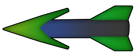
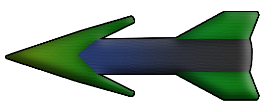
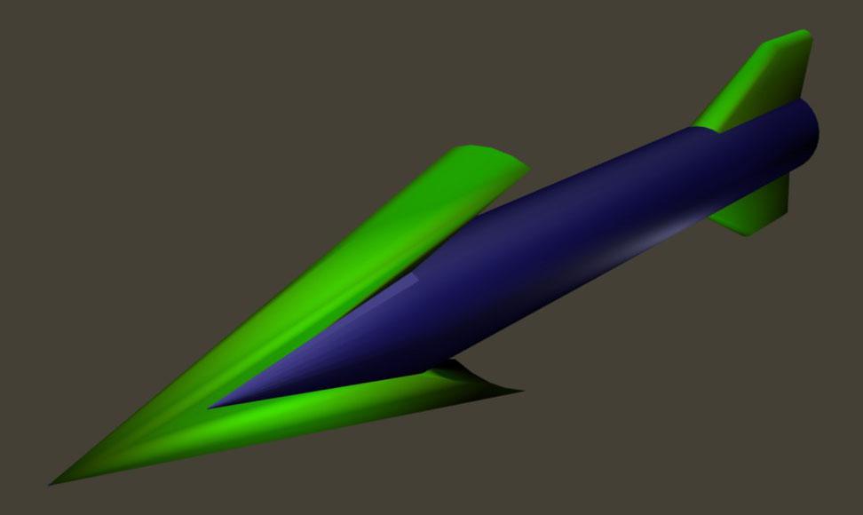
Recently, I have spent some thoughts about a logo that could be associated with SFML's philosophy "simple and fast", and I came across an object that clearly fulfills these properties: An arrow. I experimented a little bit with a logo that incorporates an arrow. I'm not a great artist, but tell me whether you like the general idea. The following pictures are scaled to half size, in order to be displayed without scrolling.

Raw:


Contour and shadows:


Shiny:


Only arrow:

Arrow with more shadows:

3D model of the arrow:
Zloxx II: action platformer
Thor Library: particle systems, animations, dot products, ...
SFML Game Development:

Grimshaw

  • Hero Member
  • *****
  • Posts: 631
  • Nephilim SDK
    • View Profile
Re: A new logo for SFML
« Reply #282 on: March 30, 2013, 11:42:46 pm »
I dont dislike the arrow idea and concept, but looking at that one i dont feel its the right one.. : )

jabza

  • Newbie
  • *
  • Posts: 22
    • View Profile
Re: A new logo for SFML
« Reply #283 on: March 31, 2013, 08:43:30 am »
The arrow is a neat idea, I like the idea of one 'simple' element to go along with the text in the logo.

Here is another more simple logo I made using the same font as before:

thePyro_13

  • Full Member
  • ***
  • Posts: 156
    • View Profile
Re: A new logo for SFML
« Reply #284 on: March 31, 2013, 08:44:16 am »
Maybe rather than an actual arrow, a stylised arrow(such as those used to represent vectors) would be more appropriate, as it can be seen as an arrow, but is also a much more simplistic icon.