I totally agree with eXpl0it3r.
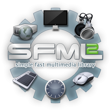
Just to summarize our journey to find a SFML 2 logo -- in 2011, we had the logo with multimedia symbols, where 2 candidates were most popular:


At the beginning of 2013, we headed into a new direction, because the multimedia symbols were too heavy. After a long time, we concentrated on a few logos including a power button:


Then, we incorporated the arrow:


Every time, people were excited about the logos, and even Laurent said they would look nice. Suddenly, somebody has another idea, and we have to throw away everything.
This process can go on forever, and it's frustrating for people who have put a lot of effort into the logos. Consider the amount of time we have already been searching for an SFML logo. In the last few weeks, there have been a lot of really good ideas coming up. In my opinion, we should invest the remaining time on refining them, instead of wasting it with completely new ideas again and again.
We can still search a new logo for SFML 3, but then we have enough time, don't need to delay the SFML release and aren't forced to find a last-minute decision.